We see logos every day, on apps, packaging, ads, and social media. But how well do we really remember them?
Several studies reveal a surprising truth: even the world’s most famous logos are often poorly recalled from memory. People recognize them instantly, yet struggle to reproduce or describe them accurately. This gap offers valuable insights for brands looking to build stronger, more memorable visual identities.

Logo recognition vs. logo recall: What’s the difference?
One of the most important findings in logo memory research is the distinction between recognition and recall.
Recognition means identifying a logo when it appears in context.
Recall means reproducing or describing it from memory without visual help.
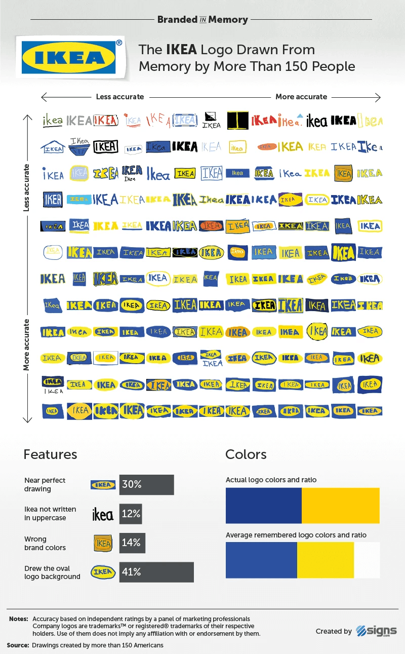
Most brands perform well on recognition, but far worse on recall. This suggests that consumers store general impressions of logos rather than precise details.
Your logo doesn’t need to be remembered perfectly, it needs to be instantly recognizable.
Why famous logos are harder to remember than we think
Research shows consistent patterns when people try to draw or recall logos:
Complex logos with many elements are recalled poorly
Human figures and mascots are harder to remember accurately
Simple geometric logos perform better, but still imperfectly
Colors are remembered more reliably than shapes or proportions
This confirms a key principle in branding psychology: the brain favors speed and efficiency over visual accuracy.
What makes a logo more memorable? 5 key branding principles
1. Simplicity improves brand recall
Simple logos reduce cognitive load, making them easier to process and remember. Fewer elements = stronger mental encoding. Simplicity is one of the most important logo design principles for brand recognition.
2. Distinctive shapes create mental shortcuts
Unique silhouettes or symbols help logos stand out in crowded markets and trigger faster recognition. A strong shape can work even when details are forgotten.
3. Consistent brand colors strengthen memory
Color is often the most memorable logo element. Brands that use consistent colors across all touchpoints build stronger visual associations. For example, Coca-Cola red or IKEA blue and yellow.
4. Emotional meaning beats visual detail
Logos connected to a clear brand story, value, or emotion are easier to remember than purely decorative designs. Meaning creates memory.
5. Versatility across digital touchpoints matters
Logos must work at small sizes (apps, favicons, social icons). Scalable, flexible designs increase exposure, and repeated exposure improves recall.
Great logos are designed for the brain, not just the eye
The best logos aren’t necessarily the most detailed or artistic, they’re the ones that align with how people actually see, process, and remember brands.
By prioritizing simplicity, consistency, and meaning, brands can create logos that don’t just look good, but work as powerful tools for long-term brand recognition and growth.
If you’re looking to build or evolve a brand that’s designed to be remembered, LOUD can help you define a clear, strategic branding system that connects design, psychology, and marketing.